This summer, I will be releasing all 20 Teacher Creator’s Toolbox videos here on the Core Inspiration blog. Teacher Creator’s Toolbox is a comprehensive guide to help you succeed as a seller in the TPT marketplace. If you are interested in watching these video tutorials in chronological order, visit my video index here.
What You’ll Learn
(00:18) Clip Art Considerations
(00:37) Building A Clip Art Collection
(02:04) Clip Art Integration Techniques
(02:24) Layering Clip Art
(06:53) Sizing Clip Art
(07:30) Line Drawing and Greyscale Images
(08:10) Converting A Color Image To Greyscale
(08:30) Tips For Finalizing Resources With Clip Art
(09:25) Sharing Favorite Clip Art Artists
Tool 10 Transcript
Clip art is one of the best ways to add style and visual appeal to your resources. I certainly cannot create a tutorial on how to choose the right clip art because that all depends on the resource you are creating, the audience you are targeting, and your own personality. But I will provide you with some tips for finding clip art and incorporating it into your resource designs in creative ways.
Starting Your Clip Art Collection
First, let’s talk about collecting clip art. A few clip art essentials you will want to collect to get you started are:
- A set of digital frames
- A set of digital papers/backgrounds
- 1-2 sets of images that fit the type of resources you want to design
When you are first starting as a teacherpeneur, you probably won’t want to break the bank on clip art. To avoid this, spend some time visiting TPT’s clip art category and sorting by price so you can see the free options available to you. Downloading freebies and incorporating free clip art into your resources will allow you to hold your own against competitors who have a larger clip art collection while sticking to your budget.
If you find an artist you like, be sure to subscribe to their blog or Facebook page. Many artists give monthly freebies to their followers. This is a great way to build your collection quickly.
Another website to get your collection started is My Cute Graphics. This site is filled with school-specific clip art that is free for commercial use as long as you provide credit with a link back.
Clip Art Design Techniques
Once you have a small collection of images, it’s time to add them to your resources. A few techniques that will create a professional design are:
- Overlaying
- Ignoring margins
- Using Greyscale and Line Drawings
- Thinking big (or small)
Overlaying
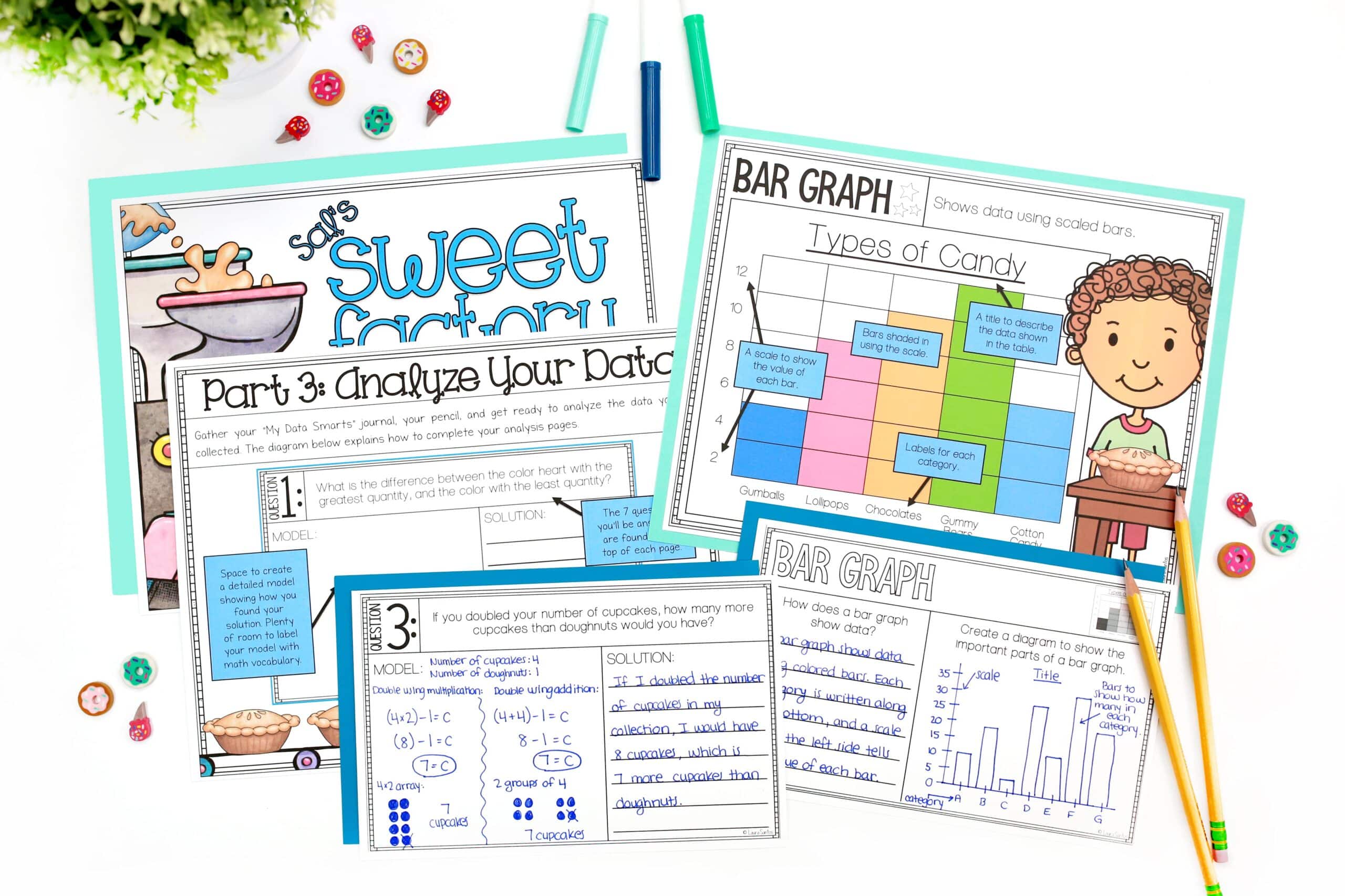
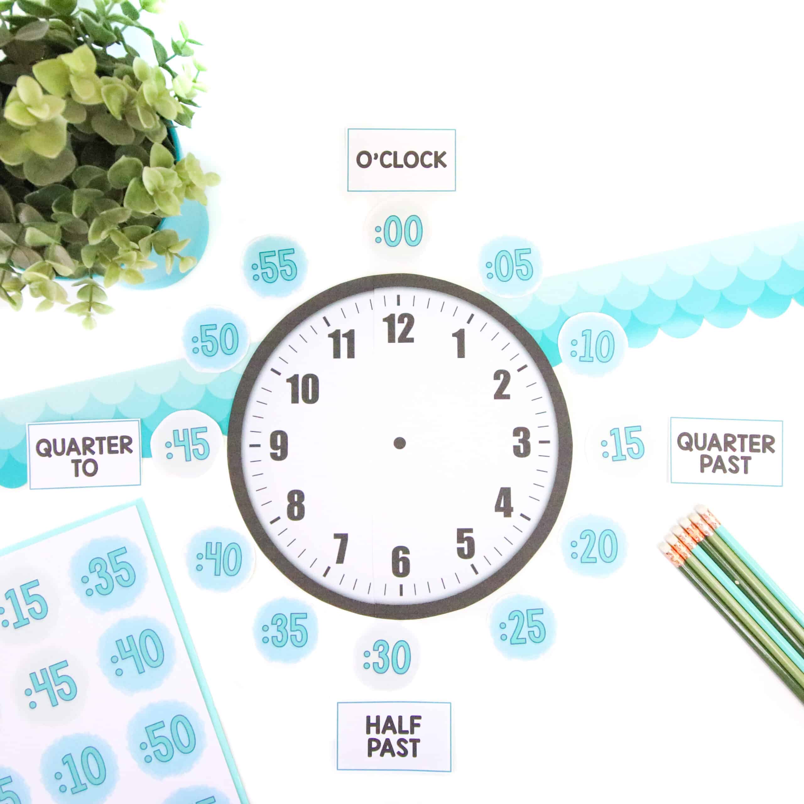
Laying multiple images on top of one another, rotating them and adjusting their layering position helps to create a more dynamic design. If done carefully, you can fit more on the page when layering than you can when you give everything it’s own bubble of space. Here’s how I created the layered look for this page.
I like to start with the largest object first so I have a focal point. I insert the art by following these steps:
- Click “home”
- Click “picture”
- Select “picture from file”
- Find the desired image
In the interest of time, I am simply going to copy and paste each of the elements I’ve used from the finalized page rather than adding a duplicate of each one.
I will position the piece of art I want to have as my focal point by grabbing the corners to resize and use the rotate tool.
Sidenote: When you purchase clip art, you should be able to size the image so it fills the entire page without losing any pixel quality. If art that you purchase does become pixelated with you resize to fill a large space, it’s time to find a new artist. This has only happened to me once and it was a freebie, so I’m thinking it’s a pretty rare thing. There are plenty of professional clip art artists out there who use high-quality design programs to create high-quality art.
I will then add accent pieces until I feel the page is balanced. As I add each piece, I will make decisions about layering in a way that looks polished. There are three ways to adjust the laying of your images on a page in PowerPoint.
First layering approach:
- Select the image
- Click “format picture”
- Click “arrange”
- Scroll down and select “reorder objects”
A layering screen will appear. You can then highlight the different layers and rearrange them by clicking an image, holding down the mouse button and dragging the image to the layer you want.
The second way is to follow those same first three steps> select the image > click “format picture” > click “arrange” and scroll down to one of the arrangement choices.
- “Bring to front” will place the image on top of everything else on the page
- “Send to back” will send the image all the way to the bottom layer
- “Bring forward” will bring it one layer forward
- “Send backward” will send it one layer back
The final way to make these layering adjustments is to right click the image and scroll down to “arrange” so you can select the positioning you want.
Ignoring Margins
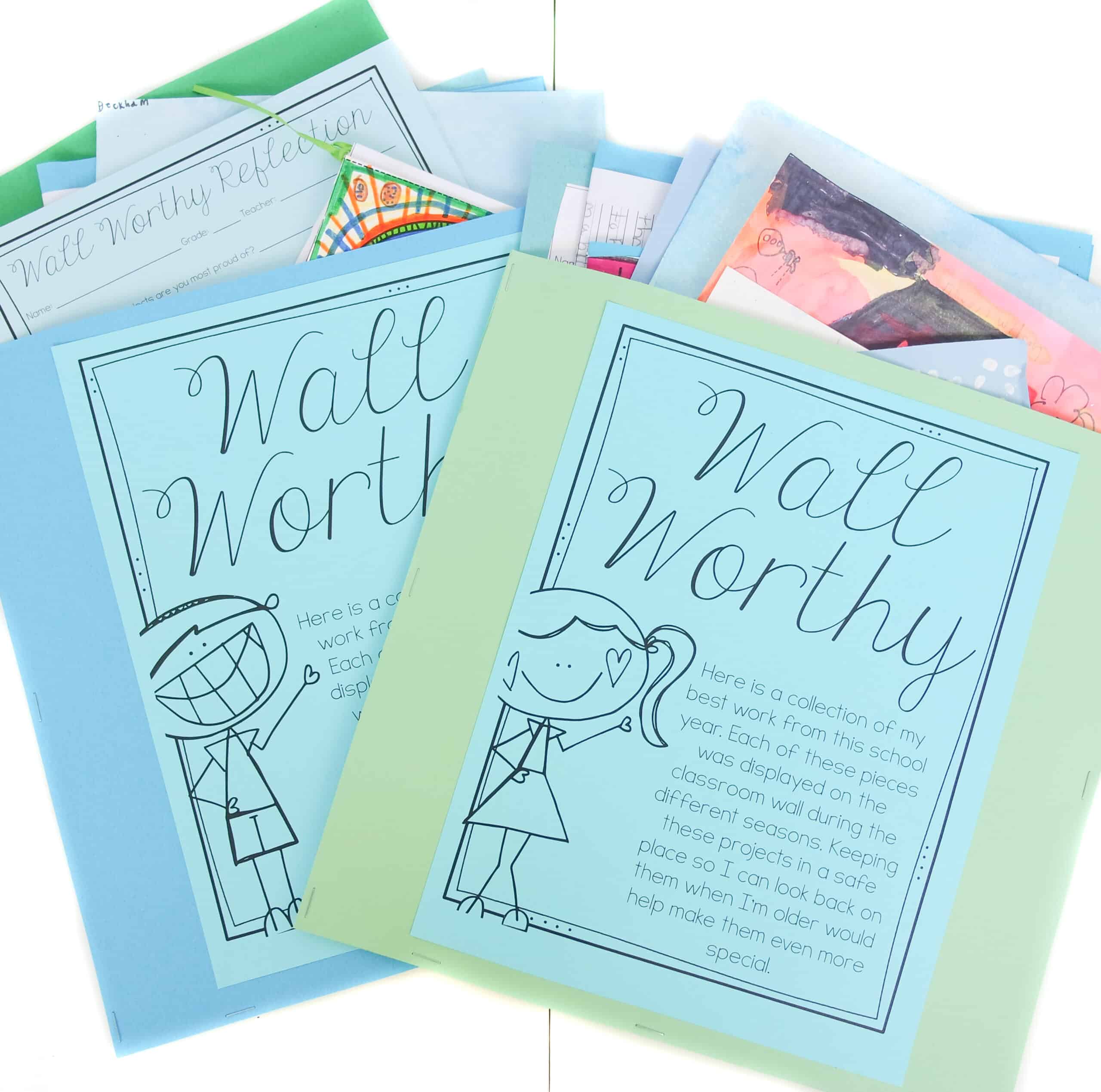
As you saw in the last example, I like to ignore the page margins when it comes to adding art. Although there are times when keeping everything in the margins looks great, I have recently started hanging art of the sides of the page and I am loving the look!
I think of it as an alternative and more dynamic way of framing the text. To get this look, drag the corners of the image’s frame until it is larger enough to hang off the page. Then, incorporate layering if desired.
This technique can also be used on printables so you still have lots of room for the content but also have that fun visual that compliments the content in a unique way.
Think Big (Or Small)
That leads right into the next technique, which is think big (or small). Something that will set you apart from the crowd is incorporating large images on your cover page or content pages if appropriate.
You need to be cautious with this technique when it comes to content pages. Although large images add interest to a reproducible, the page should mostly be filled with content, which is main asset that adds value to your resources. If customers see your pages are too cutesy and there isn’t enough meat to them, they will not become a repeat buyer.
Line Drawing and Greyscale Images
One last clip art tehnique is to incorporate line drawings and greyscale images on reproducible pages.
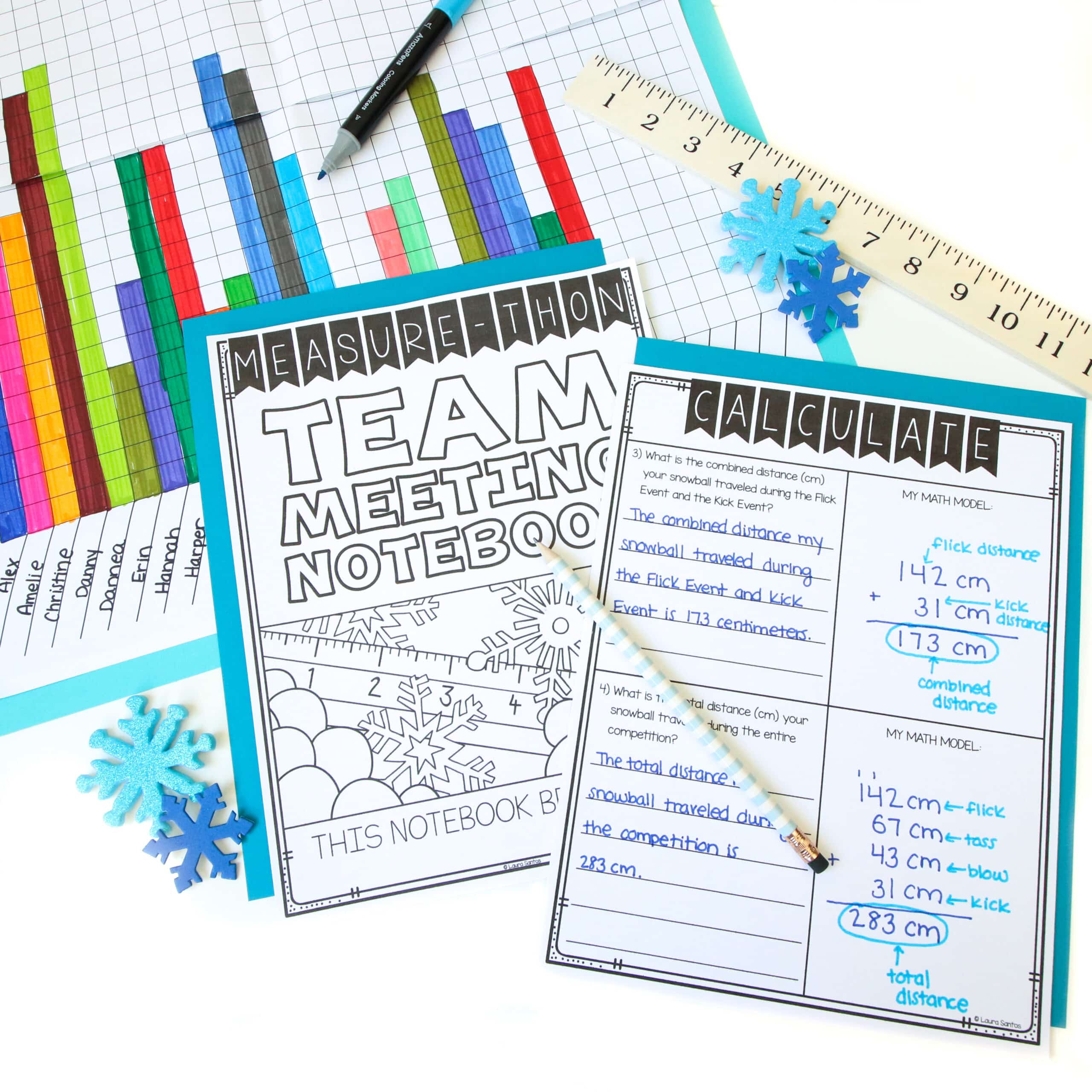
Many graphic artists include line drawings and full color images in their clip art sets. A line drawing is simply the image outline with no fill or color.
It is wise to use line drawing images on reproducible pages because it saves teachers ink when they print. If line drawings are not included in your clip art purchase, you can help your reserve some ink by converting your images to grayscale so they don’t waste color ink, or their black and white printer doesn’t waste too much black ink on dark, bold images.
To change an image to greyscale, simply click the image, then click “format picture” and select “recolor”. Find the greyscale option and select it.
Creating Duplicate Slides To Make Design Decisions
Remember, incorporating clip art into your resources takes time and you will likely make many modifications to your design before you have your final design.
One of the best ways to make a decision on whether your clip art design is the most visually appealing is to duplicate the slide your are designing. Simply right click and select duplicate.
Then, create several layouts. Seeing them side-by-side makes the decision-making process much easier than trying to recall what previous designs looked like after you have made modifications. When you have come to your final decision, simply highlight the designs you don’t wish to use and click delete or backspace on your keyboard to eliminate them.
I hope these clip art tips and techniques will inspire your to think outside the box when adding art to your resources.
If you have a favorite artist or know of one who provides monthly freebies to their followers, share your knowledge in the comments below.
Up next in tool 11, I will show you how to add photos to your resources and share a few rules you need to know if you want to use photos in your designs.


