This summer, I will be releasing all 20 Teacher Creator’s Toolbox videos here on the Core Inspiration blog. Teacher Creator’s Toolbox is a comprehensive guide to help you succeed as a seller in the TPT marketplace. If you are interested in watching these video tutorials in chronological order, visit my video index here.
What You’ll Learn
(00:28) Why Include A Product Preview?
(01:24) Why Customers View A Preview
(01:48) Parts Of A Product Preview
(02:34) Modifying Your Resource To Efficiently Create Previews
(03:40) Creating Thumbnails For Previews
(04:10) Resource Pages To Keep In A Preview
(05:36) Product Overview Page
(06:15) Product Elements Page With Thumbnails
(07:35) Resizing Thumbnails Efficiently
(08:57) Making Thumbnails Pop With Borders
(09:32) Standards Alignment Page
(10:07) Layering Visuals To Give A Closer Look
(11:31) Adding Captions To Give More Information
(13:00) Recommended Products Page
(13:18) Adding A Preview Watermark
(15:08) Reducing The Size Of A Preview File
Tool 14 Transcript
In this tutorial, I am going to share tips to help you create powerful previews that lead to educated purchases.
When you finally finish designing a product, it is ever-so-tempting to skip creating a preview and get right to selling. Trouble is, an email gets sent to your followers within 24 hours of your new product posting. Those already-loyal customers may visit your product page before you get a preview uploaded. Those same visitors may walk away from a purchase because they aren’t provided with enough detail about your newest resource. This is a complete waste of a one-time primo marketing opportunity. If done consistently, you may even lose a follower.
On the other hand, when you think of product preview creation as part of the process of finalizing a resource, your products will be purchased more often and the people who purchase your products are more likely to give positive feedback about their well-informed purchase.
Anatomy of A Product Preview
To get started, let’s take a look at a product preview. Teachers open your preview for one of two reasons – your title and cover page captured their attention or your product description led them to want to learn more. Either way, they are not quite ready to make a purchase, so it’s time to display what your resource can provide them in a way they can’t resist!
The following elements will help get the job done:
- Product Overview: this is a blurb that paints a picture of how the product can be used in the classroom.
- Product Elements: this a list of the major elements included in the resource along with a short description (preferably accompanied by thumbnail visuals).
- Standards Alignment: this page explains the standards your resource helps to address. Simply listing the numbers of each standards isn’t as effective because not everyone uses the same standards.
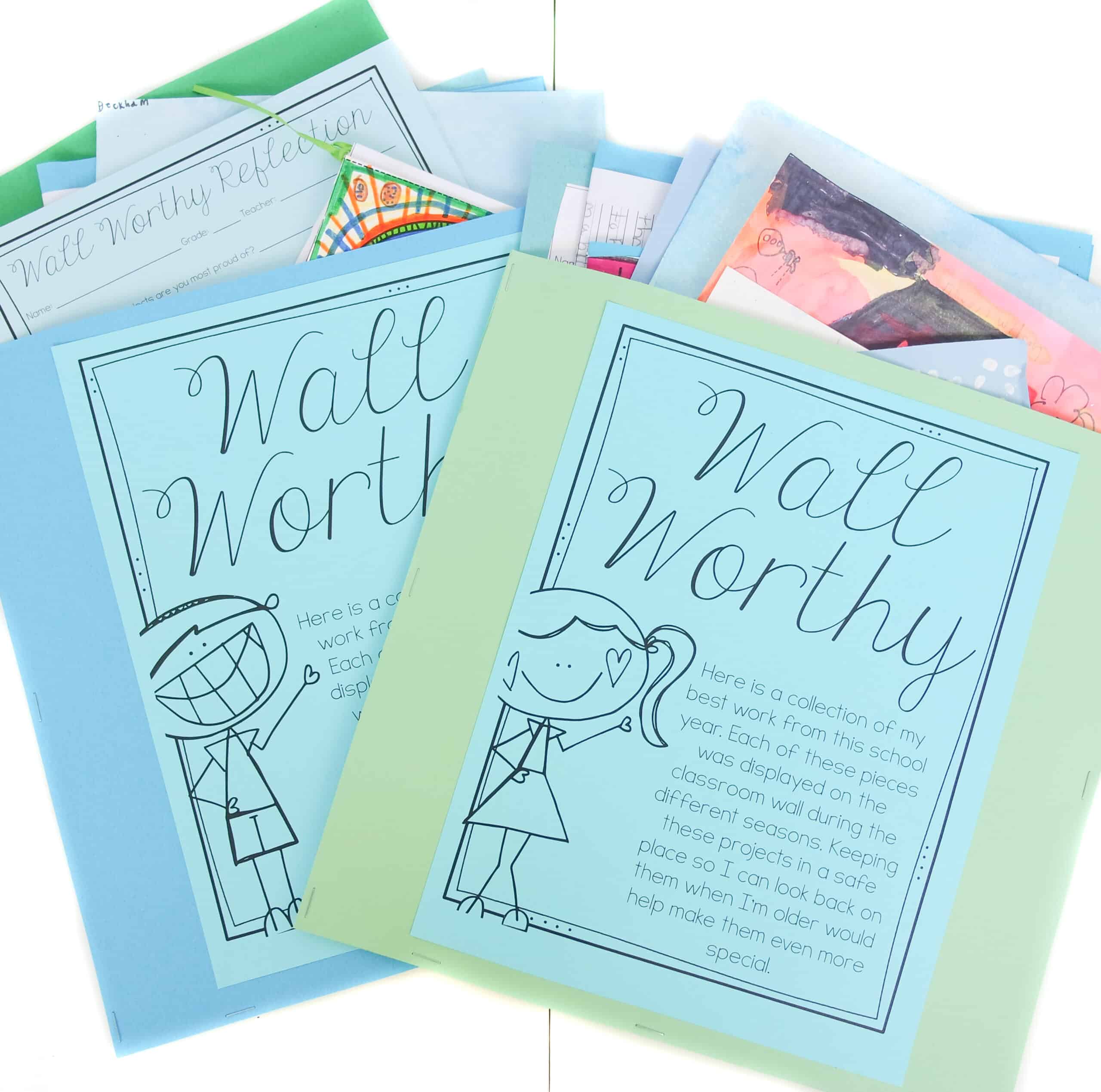
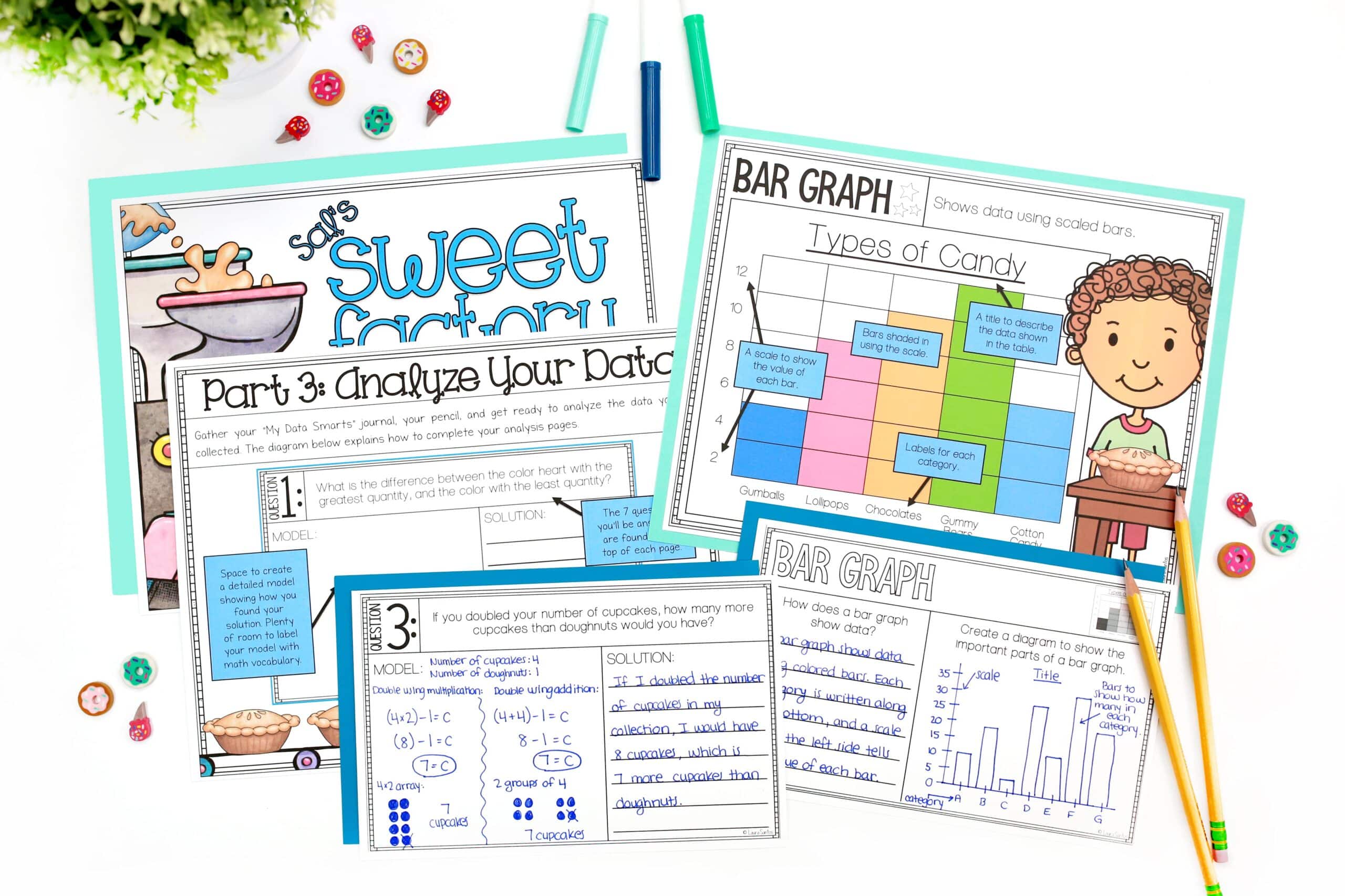
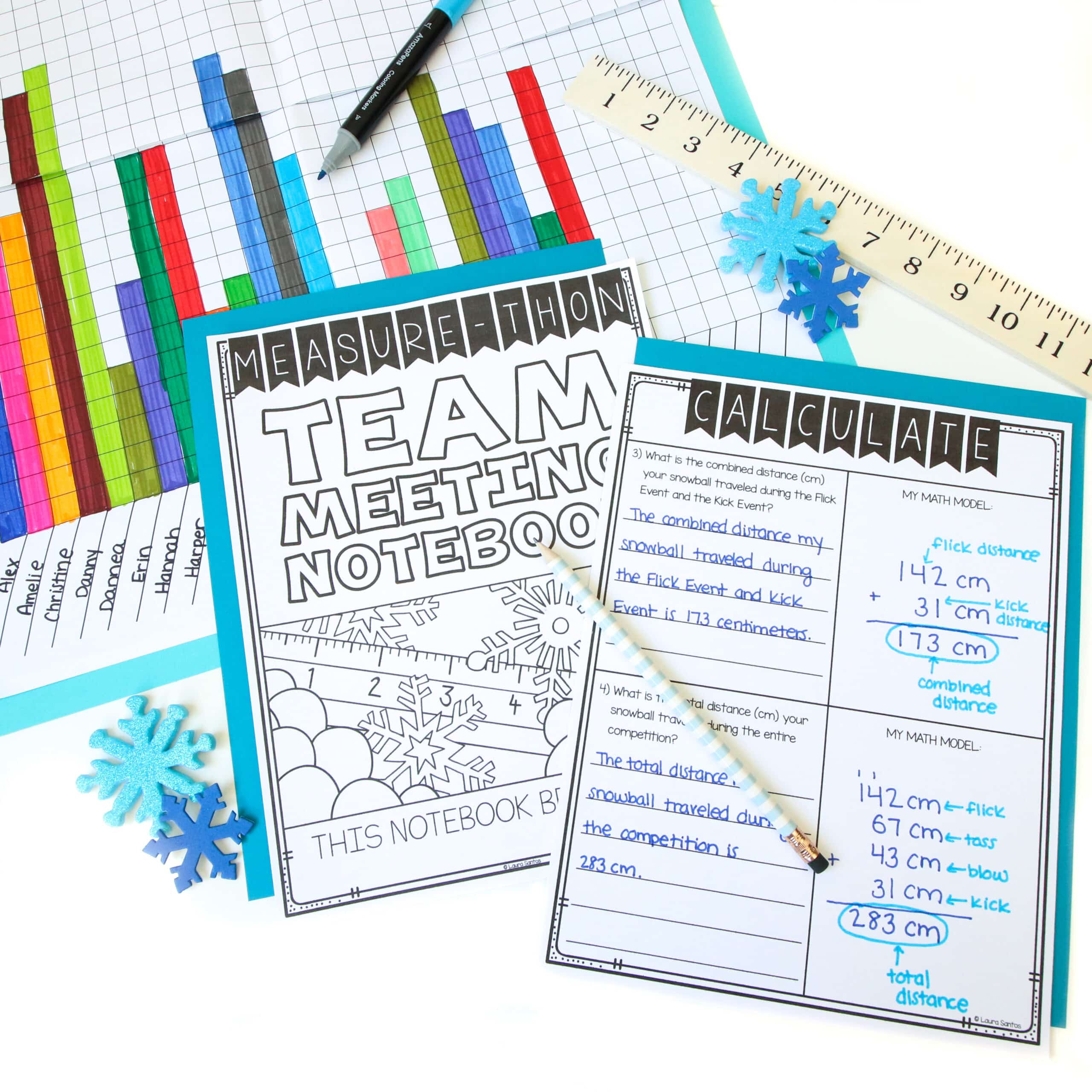
- Visuals – A closer visual look at each element outlined in your product elements list. These must be strategically layered so they give the potential customer a good idea of exactly what they’re going to get without giving it to them for free.
Modify Your Product To Create A Preview
When creating a product preview, using the same program you used to designed the resource makes the process a bit more efficient. That’s because you can simply modify your finalized product into a preview. I use Microsoft PowerPoint to get the job done. Here’s how.
After doing a final save of your completed resource, save it again under a different name. I usually write “PREVIEW” in all caps before the file name. Confirm that a new file was created by checking the window title. Then, save all the slides of the resource as pictures. To do so, click “file” > “save as pictures”.
I always save the pictures to the desktop so they are easy to access during the next few steps. Head to the desktop to open your folder of pictures. As you can see, each slide is now saved as a flattened JPEG. You will use these images in a moment when you’re done prepping.
Back in the preview document, I delete all the content of the resource, again making sure I am in my “PREVIEW” version of the file. I only leave the cover page, recommendations page, program overview, program elements, and standards alignment.
I can delete several slides at a time by clicking, holding the “shift” button on my keyboard, scrolling, and clicking the last slide I want to delete. Then I hit “delete” or “backspace” on my keyboard. Now my resource is prepped for preview creation.
Product Overview
Let’s take a closer look at the product overview. In the overview, I aim to help the teacher visualize how my resource will be an asset to their teaching. Often times, a lot of this language can be copied and pasted into your product description. I include it in both places because there are several customers who go directly to the preview download without reading the product description blurb.
You can read various examples of my product descriptions by either visiting my store or downloading the PDF document here where I have compiled some of my product previews to save you time.
Resource Elements
Next up, resource elements. This page gives a specific description of each element included in the resource. Next to each element, I include a small visual. This makes it easier for the customer to understand exactly what I am referring to.
My preferred format for this page is two columns. The description itself is in a text box, which I can easily resize. The thumbnails are gathered from the JPEGS created when I saved the resource as pictures.
Let’s take a look at formatting these thumbnails.
First, I am going to add an extra slide so I have a blank canvas where I can quickly paste and resize images. I open the folder of JPEGs on my desktop and add each image I want to include on my resource elements page. by clicking “edit” > “select all” > “copy”. Paste them each into the preview document.
Once I have my images, I am going to resize all of them simultaneously so they are uniform in size, creating a more polished, easy-to read page. To do so, I click “edit” > “select all” OR “command” “A” on they keyboard, OR drag my cursor over all the images and release.
Once I have them resized, I copy and paste the pictures onto the resource elements page. If I need to resize again, I simply drag over all the thumbnails and release, then resize. It takes a little tinkering to get a layout that isn’t cluttered but once you’ve got it, the page will become an easy reference for your customers.
Standards Alignment
On to standards alignment. This part of the preview is very straight-forward because it is simply a formatted list of standards.
I recommend including the grade level, the standard number, and the actual text for each standard. This allows teachers from around the world to analyze whether this resource addresses the standards they teach.
In California, we teach the Common Core Standards. The site I refer to to get the text for my standards is here. Feel free to add links to the standards you use in the comments section below.
Visuals
Next up are the visuals. You will once again use the JPEG files you created in the first steps of this process. This is an opportunity to give potential customers a closer look at each of the product elements. It is essential to layer them strategically so they cannot easily be lifted from the preview and reproduced without purchasing. Here’s how:
Use your blank slide canvas to quickly paste and resize images. Grab the images you want to add to a page. I usually add several images because I like to show potential customers as much of the product as possible so they feel comfortable making the purchase. Once you have all the images, click “select all” and resize the images. Next use the rotate tool to shift each page and create a more dynamic layered look.
To give your potential customers more information about the visuals you have chosen to include, you can add a quick caption using a text box. I like to make the captions pop a bit by layering them on top of a clip of digital scrapbook paper.
Recommended Products
The recommended products page is a little something I recently started adding to some of my previews. If you are interested in learning about this extra step, watch Tool 20.
Finishing Touches
In order to get this preview ready to upload to TPT, I am going to save it as a PDF and open it in Adobe Pro so I can reduce the file size and secure it.
In the next tutorial, Tool 15, I will give you a few pointers on bundling related products.



6 Responses
I could not find the downloadable file for product descriptions.
Hello, thank you for letting me know. You can find the file here.
I love these videos! I keep having to pause them while I make a to-do list and scribble notes furiously. You are so generous to share this information and the skills you’ve learned. I use a PC, and I’ve been able to adapt everything you’ve shared from Mac to PC without a problem.
So happy to hear that!
A tip: you can also fill the text box with a picture, and select the paper you want. That saves a step.
This series of videos is amazing. I am trying to start selling items and you have been a lifesaver. You are explicit, of clear voice ,and have great pacing in your delivery on camera. I think I have watched them all several times… Thank you so much for sharing your skills.