This summer, I will be releasing all 20 Teacher Creator’s Toolbox videos here on the Core Inspiration blog. Teacher Creator’s Toolbox is a comprehensive guide to help you succeed as a seller in the TPT marketplace. If you are interested in watching these video tutorials in chronological order, visit my video index here.
What You’ll Learn
(00:31) Why Presentation Sells
(01:01) How the 5 Design Tools Help You Master Presentation
(01:17) Pairing Fonts
(01:26) Font Pairing Mistakes To Avoid
(01:50) Selecting A Body Font First
(02:28) The Graphic Designers’ Font Rule
(02:42) Achieving Font Concord
(03:24) Creating Font Contrast
(04:58) Avoiding Font Conflict
(05:37) Where To Find Free Unique Fonts
(06:40) Create Your Own Fonts
(07:02) Where To Find Paid Unique Fonts
(07:20) How To Download and Install A Font
(08:29) Sharing Favorite Fonts
Tool 8 Transcript
The number one priority in building a successful classroom resource is high-quality, unique content. Once you have an idea that helps students learn in a unique, research-grounded, and engaging way, you’ll want it to share it with a wide audience. The best way to get the attention of that audience is presentation.
Think of your classroom resource as a delicious dessert made from your secret family recipe.
If you made two servings of your dessert, displayed one on a cake stand with the appealing garnishes, then covered the other in saran wrap and placed them both on a table at a pot luck, more people would be gushing over the contents of your cake-stand dessert, and maybe a few brave souls would come to realize that the saran-wrapped dessert is also quite delicious.
My five design tools will help you transform your high-quality idea into a professional, visually appealing classroom resource that teachers will be gushing over. The first of these design tools will help you with font selection.
Pairing Fonts
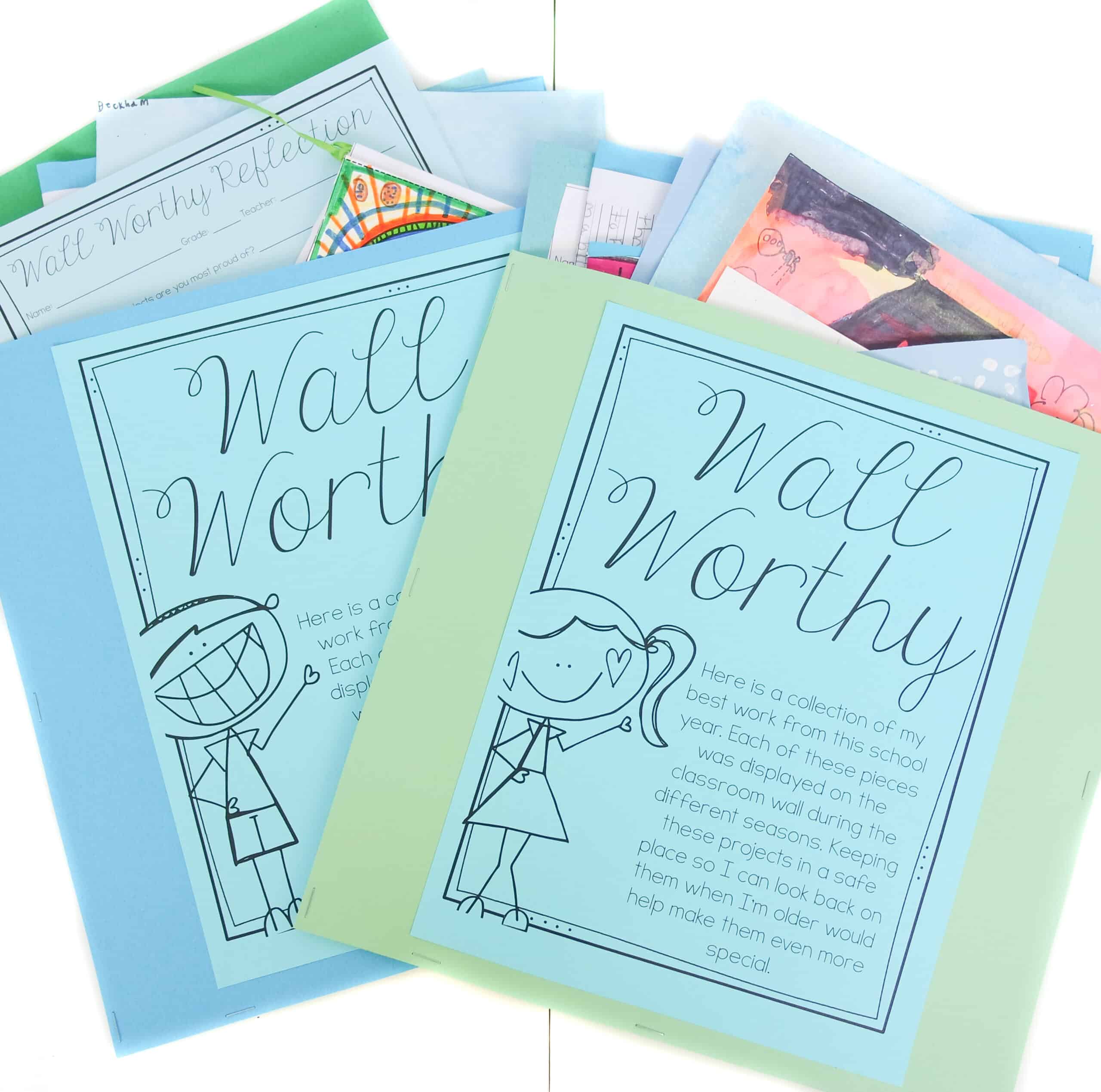
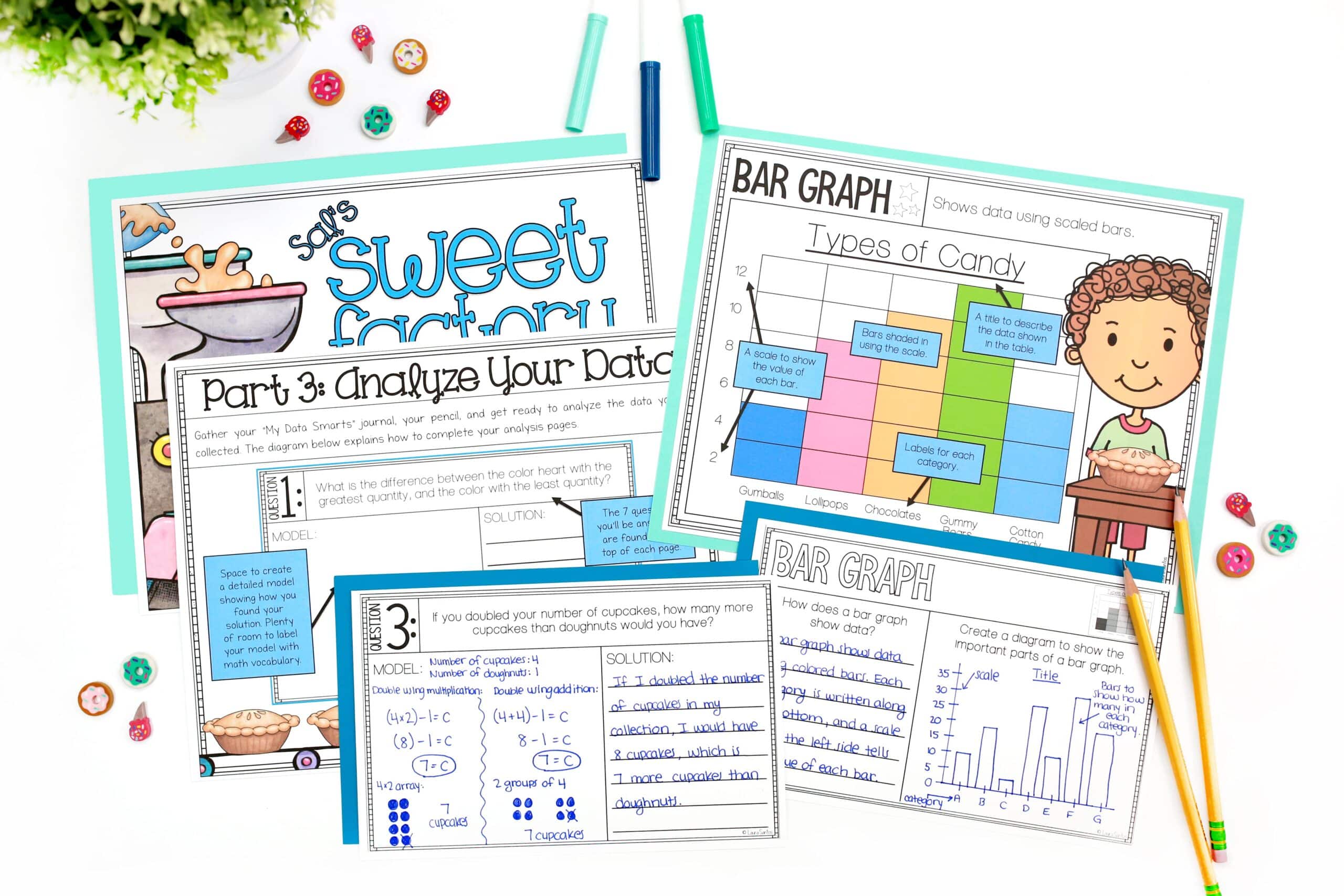
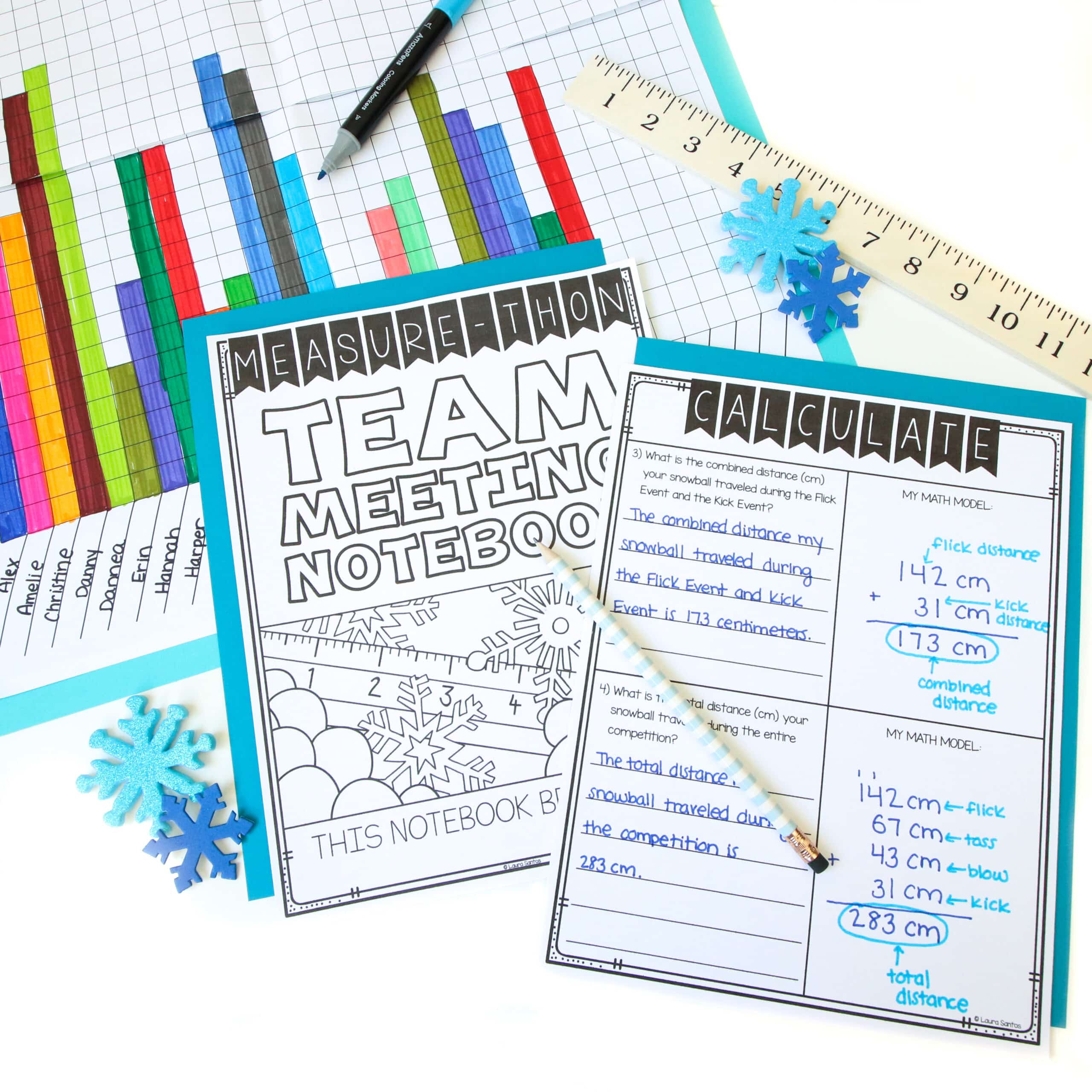
When it comes to selecting fonts for your resources, you should pair fonts that compliment one another and don’t fight for attention on the page. If your page is filled with too many typefaces, conflicting typefaces, or fonts that are too decorative and difficult to read, students who use the resource will struggle to concentrate on the content.
The layout of your resource pages should be like the walls of a classroom – decorative but not so decorative that they become a distraction.
The rule of thumb I use when designing resource pages is to select the body font first because that is what the students will spend the most time reading.
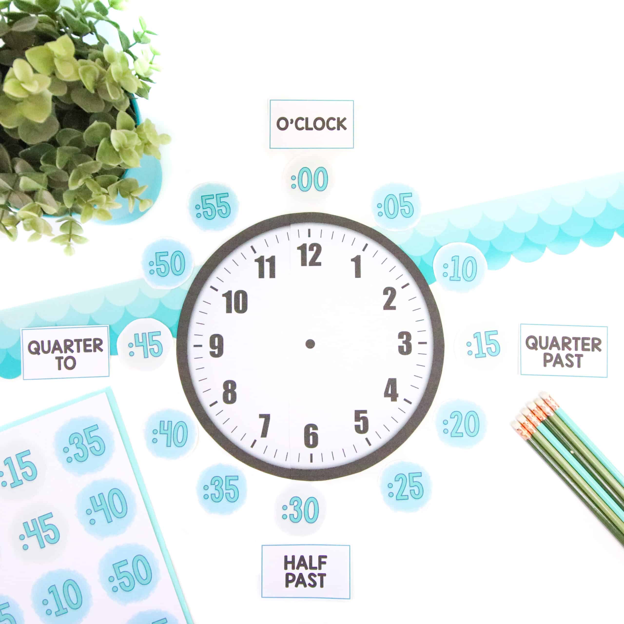
By selecting a crisp, readable font that has a hint of fun, I can ensure that the content of the resource is visually accessible to young eyes but also visually engaging.
Students will have a lot more fun working with a resource that has readable fonts with a hint of personality than they will with a resource that incorporates the boring old Times New Roman or Arial.
Concord and Contrast But Don’t Conflict
As a Teacher Creator, you must play by the rules of a graphic designer when it comes to fonts. That rule is:
Concord or contrast, but don’t conflict.
First let’s discuss concord. This is the pairing of fonts that have the same trait. They could share proportions such as cap height – the height from the base line to the top of the upper case letters. Or x height – the height from the base line to the top of the lower case letters. Fonts with concord can have the same kerning, or spacing between each letter or symbol.
Often times fonts in the same family, or made by the same designer, have concord. But if you really spend time analyzing fonts, you can successfully pair different designers.
Contrast is about finding totally different, but still complimentary, typefaces. These are 5 factors that help create contrast.
The most common way to contrast is to pair a serif with a sans serif. A serif if the small line attached to the end of a stroke in a letter or symbol. These small lines help the eye move across the page when reading large groups of text.
Sans is French for without. Sans serif means without serif, which is why sans serif fonts do not have these small lines at the end of each stroke.
Other Ways To Create Contrast
The secondly to create contrast is with style. Heavy fonts with a strong personality can be paired with more subtle fonts that bring a calm balance to the page.
Of course, reserving the bold styles for headings or cover pages is always recommended as they are easy to read in small doses but make the yes tired when used as body text.
A third way to create contrast is through font size. This is very straight forward – pairing big with small.
Weight can also be a contrasting factor. Bold, heavy fonts can be paired successfully with fonts that have light, thin strokes.
The last way to create contrast is with color. This is important to consider when designing cover pages but not as important when creating actual content pages as many teachers print in black and white.
For recommendations on avoiding conflict in font pairing, I recommend visiting the resource A Beginner’s Guide To Pairing Fonts for detailed visual examples of factors that create conflict. Another amazing resource from our fellow TPTer, Kimberly Geswein is her Font Pairing Guide.
Keep in mind, pairing fonts becomes easier with time as you begin to get a feel for which fonts fit your brand.
Where To Find Commercial Use Fonts
Now that you have a bit of background about font pairings, you may be wondering how to find those beautiful fonts that aren’t in your Microsoft font list.
In the interest of helping you create resources that have a higher return on investment, I will share a few sites that have free commercial use fonts.
Free Scrapbook Fonts is a great place to start your font collection and develop you keen eye for unique font pairings on a budget.
Font Squirrel has a wide variety some are appropriate for classroom resources but you will have to do more sifting
Really Quite Lucky has a small selection that are great for classroom resources
You can also download free font on TPT by searching for fonts, then clicking “By TPT Sellers for TPT Sellers”, and sorting by price.
Another cost-saving option is to create your own fonts. I have never ventured into this realm of creating but the most highly-recommended app used by other teacherpreneurs who design and even sell their own fonts is iFont Maker.
If you are ready to start spending money on fonts, you can find commercial use fonts on Teachers Pay Teachers (in the By TPT Sellers for TPT Sellers category), Urban Fonts, and DaFont.
How To Install Fonts On Your Computer
I am going to show you how to download and install a font from TPT. Keep in mind, I am using a MAC with the OS X operating system, so your process may be slightly different. I and have written these steps in the Font Download Process PDF here along with steps for how to download fonts using a PC.
I will find the font I want, and click “Download Now”. Notice my download bar in the upper right corner of my Safari browser. I will double-click the font download file. This will open the download folder. Double click the font so the font download window appears, then click “Install Font”.
In order for this font to be available in PowerPoint or any other program, I must close the program and reopen it so the font can be added to its font list. You can then incorporate the font into your resources by selecting it from the font drop down menu.
Dabbling With Font Pairing
That wraps it up for getting started with font design. This is a lot to take in at first so keep in mind its okay to tackle things in small chunks. Start by downloading a few free fonts and tinkering around with paring. Over time, your eyes and mind will master the pairing process and it will become a natural part of your resource design process. In the beginning, be sure to focus on using fonts that are readable but have a unique flair that shows they are not your typical Microsoft fonts.
Up next in Design Tool 9, I will share some tips for creating cover pages that pop when pinned or displayed in the search results on TPT.


4 Responses
I’m binge-watching these videos! They’re so great, and so helpful. I’ve been a creator for awhile, and you are really helping me refine my processes, and showing me I need more processes! I stumbled upon you when I was feeling a little like I was spinning my wheels. You’ve helped me get on track. Thanks so much!
One place I get great free fonts is Creative Market. If you sign up for an account (free), they email you the freebies of the week, which often include cool fonts. Not all work for classrooms, for sure, but they sometimes work as accent fonts. They also give cool free graphics.
Hi Lisa, thank you for the message. Glad to hear you are finding the videos useful! I am going to check out Creative Market now. 🙂
I too have been binge watching through your videos. I am just starting up with TpT so I have lots to learn. My question is….I generally use Google Slides to produce my products and have found that many of the fonts you mentioned above I cannot use in google slides (not unless i use a different program and copy and paste the work into the slides but then I cannot edit). Do you have any suggestions where i can get great fonts for google slides?
Hi Kimberly,
Thank you for the kind message! Unfortunately, I have not found a work-around for adding my favorite non-Google fonts to slides.